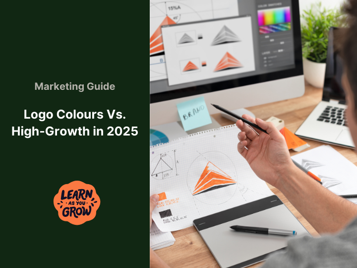
Ever looked at a logo and wondered why it pulls you in? A bold splash of colour can make a tech brand stick in your mind. High-growth companies in 2025 are leaning into vibrant hues, sleek monochromes, and grounded earthy tones to make their mark in crowded markets. If you enjoy spotting the details that fuel industry success, this is for you. At Love the Idea, we’re passionate about understanding what drives innovation and growth. Our platform provides real-time tracking of data and trends, uncovering the subtle (and not-so-subtle) patterns that inspire innovators. Today, we’re diving into one of those critical patterns: the colorful world of logos driving tech success. By the end, you’ll know why these color choices work and how you can use them for your own brand. 
Why Logo Colours Shape Tech Success
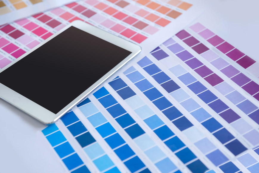
High-growth tech companies do more than build products—they build instant connections. With funding behind them and ambitious goals, they design logos that stick. Colour sparks emotions within seconds. A fiery red can energise, while a cool blue builds trust. Around 85% of buyers admit that color drives their purchase decisions, and 80% of brand recognition relies on color. This is exactly the kind of critical insight Love the Idea UK’s tracking dashboard illuminates, demonstrating how branding effectively helps companies stand out. Imagine an AI security firm using neon rainbow tones—it would confuse rather than reassure. Successful brands balance bold choices with design sense, making logos that people remember. 
Bold and Vivid Colours: Capturing Industry Buzz
Bright colours dominate in 2025, pulsing with energy and grabbing attention. Substack’s orange, black, and white feel creative and bold. Perplexity’s teal and soft blues suggest clarity for AI-driven search. Databricks blends navy and orange for power with warmth. Method uses orange and teal for approachable tools, while Gumloop’s hot pink and grey make automation fun. Finout’s purple and pink highlight cloud cost insights, and Capsule’s blue and purple show health innovation. From Fundraise Up’s green to Tive’s blue and green, these colours each tell a story.
Stats show that 62% of first impressions come from colour, so it’s no surprise these brands thrive. Too many clashing tones overwhelm, but 2025’s top players balance energy with consistency. Saturated blues, pinks, and greens are leading the way this year, signalling energy and growth.
The Rise of Monochromatic Minimalism: Sleek Style
Some of the most trusted tech brands choose a minimalist look. Black-and-white or monochrome logos communicate sophistication and focus. OpenAI’s simple design keeps its mission sharp. Intangible and xAI rely on black and white for clarity and intrigue. Oura and Odyssey use dark tones to feel sleek and professional, while Definely’s pale blue-and-white palette keeps legal tech clean. In 2025, minimal designs continue to stand strong, scaling well across devices and marketing channels. They also load quickly online, which adds to their appeal.
Data suggests 90% of snap judgments relate to colour contrast, so these high-contrast designs stick in memory. The simplicity avoids distraction and keeps users focused on the company’s core offering.
Gradients and Colour Transitions: Fluid and Forward Thinking
Gradients are everywhere in 2025. From app icons to web headers, these flowing colours suggest innovation and modernity. Guidde’s blue-to-purple gradient feels fluid, while Lightsource bp’s warm orange-to-yellow fade energises renewable branding. Gradients shine on digital screens, adapting smoothly between light and dark modes. With AI tools generating creative gradients, 36% of designers now predict more gradient-based identities ahead. These colour shifts communicate progress and adaptability, perfect for forward-thinking tech firms.

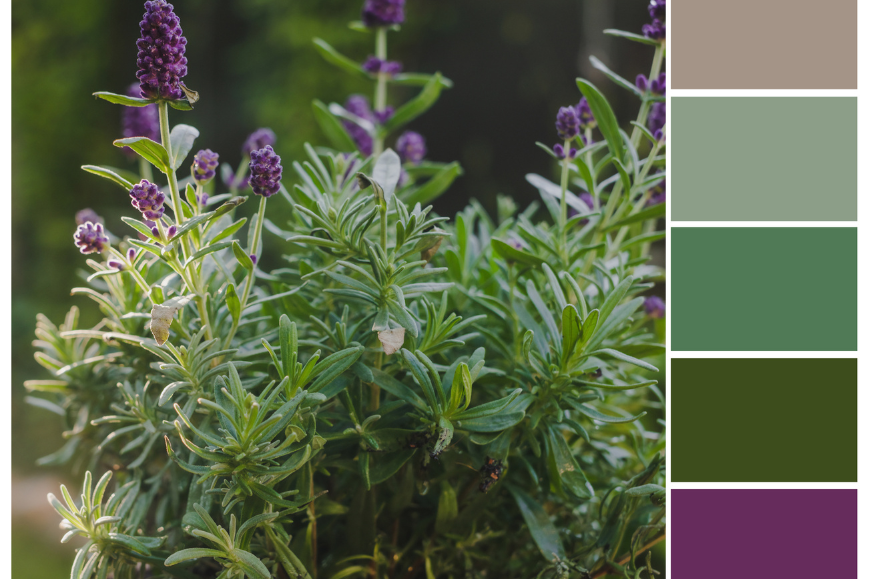
Earthy and Natural Tones: Grounded Innovation
Not every company wants neon or monochrome. Earthy tones connect technology to sustainability, which resonates with eco-conscious users. Anthropic’s greens and greys make their AI brand feel more human-centred. DRONAMICS uses dark greens to tie drones to environmental efficiency. Structured Funding Data employs deep browns for trust and grounding. In 2025, Pantone’s trending shade Mocha Mousse—a warm, rich brown—is shaping brand palettes. Calming colours like greens and neutrals build reliability while connecting tech to nature. Eco-conscious branding isn’t niche anymore; it’s becoming a core choice for trust and balance.
Stats That Prove Colour’s Industry Impact
-
About 60% of consumers reject a product if the colour feels wrong.
-
Around 42% judge websites by design, with logos often being their first focus.
-
Logos with smart colour choices increase recall by 80%.
-
Colour preferences split by gender: men lean toward blues, while women often prefer greens.
-
81% of people remember colours better than names, which makes brand visuals critical.
In 2025, warmer neutrals and serene blues are surging, helping brands feel both innovative and reliable.
Data Section: Logo Colours by Category
Bold and Vivid Colours
-
Substack: Orange, black, and white.
-
Perplexity: Teal, sky blue, and warm tones.
-
Databricks: Navy and orange.
-
Method: Orange and teal.
-
Gumloop: Hot pink and grey.
-
Access: Orange and maroon.
-
Finout: Purple and bright pink.
-
Paapi: Green and white.
-
Coco Robotics: Bright blue and white.
-
Capsule: Blue and purple.
-
Openvibe: Pink and blue.
-
Fundraise Up: Green and grey.
-
Doti AI: Blue and purple.
-
Aiwyn: Light and dark blue.
-
Liquid AI: Pink and blue.
-
Teal: Vibrant teal.
-
SushiDog: Red and white.
-
Perci Health: Light green.
-
Healf: Green and black.
-
OpenTrade: Solid blue.
-
Sanas: Solid red.
-
Tive: Green and blue.
-
Overhaul: Light and dark blue.
-
RootWave: Dark blue and green.
-
ScreenIn3D: Blue and green.
-
Ruly: Orange.
-
Favorited: Red and white heart.
Monochromatic Minimalism
-
OpenAI: Black and white.
-
DataBank: Blue and white.
-
Definely: Light blue and white.
-
Ceryx Medical: White, blue, and grey.
-
Appacut: Black and white.
-
Bono: Black and white.
-
Conifer: Black and white.
-
Intangible: Black and white.
-
Inception: Black and white.
-
xAI: Bold black X.
-
Stem AI: Black and white.
-
Oura: Black and white.
-
Odyssey: Dark blue-black.
-
Nuon: Dark blue and black.
-
Familiar Machines & Magic: Solid black.
-
HoloMem: Black and white.
-
Keystone Brewing Group: Black, white, and grey.
-
Mizar Therapeutics: Black and white.
-
Maze: Black and white.
-
SafelyYou: Grey and white.
-
Harker: Dark blue and white.
Gradients and Colour Transitions
-
Guidde: Blue-to-purple gradient.
-
Lightsource bp: Orange-to-yellow gradient.
Earthy and Natural Tones
-
Anthropic: Greens, beige, and greys.
-
DRONAMICS: Dark green.
-
Structured Funding Data: Dark brown and white.
Uncategorised
-
UC Berkeley AI marketing startup
-
Voyantis
-
Safe Superintelligence Inc.
-
OnPay
Lessons from Top Tech Brands
Top brands pick colours that match their mission. OpenAI’s black and white make them timeless. Anthropic’s earthy tones connect with ethical AI. Perplexity’s teals promise clarity in search. Liquid AI softens AI’s edges with playful tones. These logos succeed because they reflect values, not just trends. Testing colours with audiences ensures designs resonate. Strong brands refine palettes subtly over time, keeping their identity stable without losing freshness.
Crafting Your Own Tech Brand Colours
Building a new tech brand? Start with your audience. Security-focused companies often use blues for trust. Green works well for eco solutions. For audiences split 60% male and 40% female, blues and greens perform consistently well. This year’s trend leans toward vibrant accents and earthy bases. Smart brands invest in professional design, test palettes online, and adapt based on data. Remember: colours are not static. Adjust as your company grows and customer preferences shift.
Once you’ve designed the perfect logo, it’s time to bring your brand to life. A powerful brand isn’t just digital—it’s also tangible. Companies often reinforce their identity by putting their logos on team apparel, stationery, and promotional products. Create custom merchandise that matches your bold, minimalist, or earthy brand with Printful or design professional business cards and marketing materials at Vistaprint.

2025’s Logo Colour Trends to Watch
The year ahead will see electric yellows and vivid blues brighten digital spaces. Candy pinks and teal accents add playfulness, while earthy tones like Mocha Mousse anchor eco-conscious design. AI-generated gradients will continue to spread across branding. Minimalist black-and-white palettes remain strong but will often pair with colourful app design. Brands increasingly tie colours to emotion, with serene greens becoming favourites for wellness and finance tech. Citrus shades such as lemon yellow are also gaining ground in energy tech.
At Love the Idea, we continuously monitor these evolving trends, ensuring you have the data to stay ahead. Because ultimately, smart color choices aren’t just about design—they’re a core strategic asset for growth. They are the visual heartbeat of a successful brand in 2025 and beyond.